5 Interior Layout Mistakes Americans Make (And How to Fix Them)
Contents
- 1 The Most Common Layout Mistakes in U.S. Homes
- 2 How to Fix Bad Furniture Placement
- 3 Using Home Textiles to Balance Room Proportions
- 4 Layout Tips from American Designers
- 4.1 The 18-Inch Rule Nobody Tells You About
- 4.2 Diagonal Lines: A Quick Fix for Corner Rooms
- 4.3 A Designer’s Trick for Visually Distributing Weight
- 4.4 Negative Space: Why Designers Leave Room to Breathe
- 4.5 Layering Techniques for Instant Depth
- 4.6 Transition Areas: Where Designers Make the Focus
- 4.7 The One-Thirds Principle
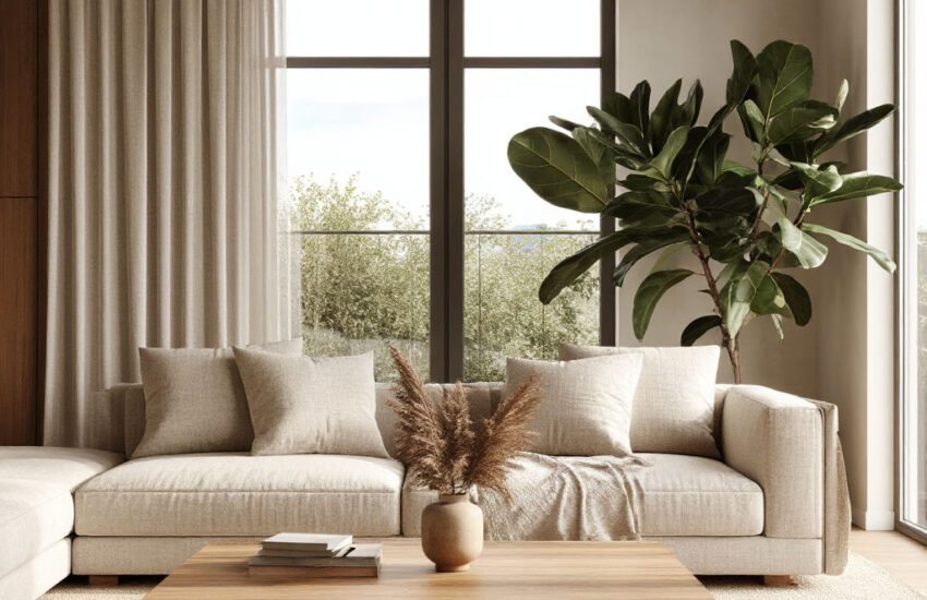
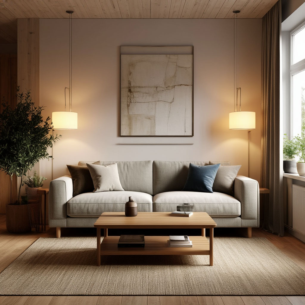
The interior layout of your home can make or break the entire atmosphere. Have you ever walked into a room and felt like something just… isn’t right? Chances are, it’s one of those sneaky interior design mistakes that creates the wrong perception. Maybe the sofa is too close to the wall, or the coffee table is blocking the natural flow of the furniture.
Fixing room layout problems isn’t as difficult as you think. With a few smart room layout tips, you can transform awkward spaces into functional (and Instagram-worthy) spots. Whether it’s balancing proportions with the right textiles or rearranging furniture for better circulation, there are always solutions to suit. So let’s ditch these common US home mistakes and make your space smarter, not more complicated.
Keep reading — at the end of this article you’ll be able to download a checklist that helps you spot and correct the most common layout mistakes
The Most Common Layout Mistakes in U.S. Homes
You walk into a room and something just feels…off. Maybe it’s too cramped, or the furniture is floating awkwardly in the space. The problem? Interior layout choices that seemed fine at first but are now making everyday life a little less comfortable. American homes often fall into the same traps—some minor, some major—but the good news is they’re all fixable. Let’s break down the top culprits so you can spot (and stop) them in your own space.
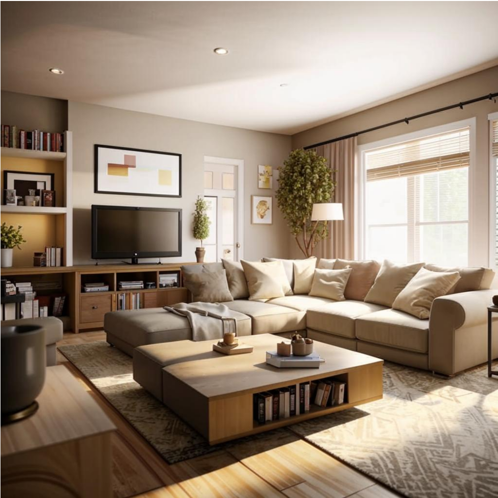
Oversized Furniture in Tiny Rooms
We get it—big, cozy sectionals are tempting. But when your living room looks like a furniture showroom after a shrink ray incident, you’ve got a room layout problem. An oversized sofa may seem luxurious, but if you’re squeezing past it just to reach the coffee table, it’s interfering with your furniture flow.
How to Fix It? Measure Before You Buy. Allow at least 30 inches for walkways and choose sleek, low-profile pieces in tight spaces. If you’re working with a studio or small apartment, consider multifunctional pieces (think storage ottomans, nested tables) to find solutions for small spaces without sacrificing style.
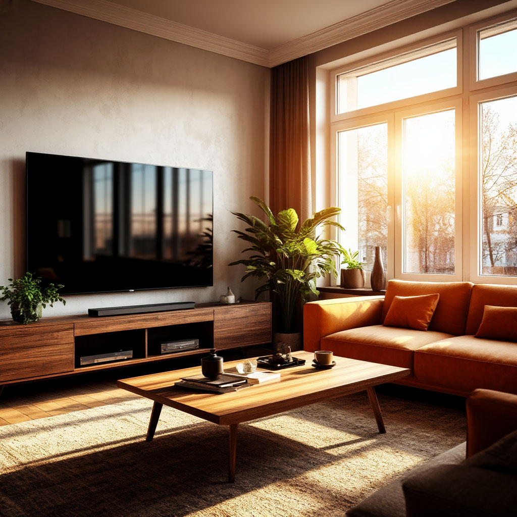
The TV Placement Dilemma
Nothing kills the ambiance of a room faster than a screen mounted too high or squeezed into an awkward corner. Yet in many living rooms, the TV is treated as an afterthought—hung above the fireplace (neck strain, anyone?) or tucked in front of a window, turning daytime viewing into a blinding struggle.
The best approach? Treat the TV as part of the interior layout, not as its dictator. The ideal height? Center the screen at eye level when seated. And if your only option is near a window, blackout curtains or an adjustable mount can save the day.
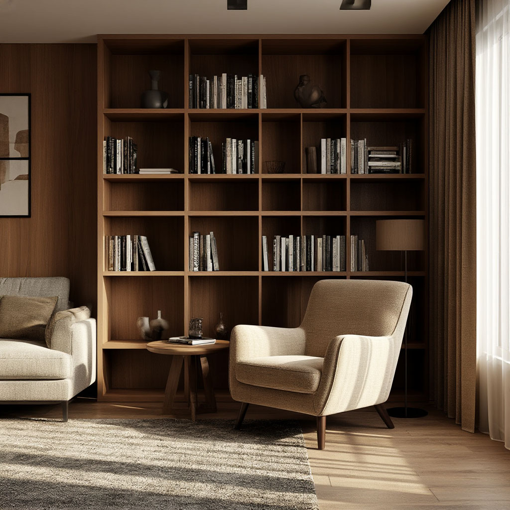
Dead Spaces and Unused Corners
That empty corner between your bookshelf and your chair? It’s not just wasted space — it’s a missed opportunity. Too many homes have awkward voids where furniture doesn’t quite connect, making rooms feel unfinished or disjointed.
Combat this by reimagining these forgotten spaces. A floor lamp, a compact table, or even a group of plants can bring balance. The goal? Seamless furniture, where every inch serves a purpose.
Lighting That Works Against You
Overhead fixtures alone aren’t enough. Harsh, uniform light flattens a room and highlights interior design mistakes (like an oddly placed chair). Instead, use layered lighting: ambient (ceiling), task (lamps), and accent (sconces, LEDs).
For example, a floor lamp near a reading nook and string lights over a gallery wall create warmth and dimension. Bonus? The right lighting can make even a cramped room feel airier — the key to small space solutions.
Blocking Natural Paths
Have you ever found yourself fidgeting between your coffee table and your couch? That means your interior layout has failed the movement test. Rooms should have clear, intuitive paths — no obstacle courses.
Rearrange furniture to make it easier to walk through. Make main walkways at least 36 inches wide and avoid floating furniture in high-traffic areas. If you have a cramped room, try tilting chairs or using round tables to soften corners and improve furniture movement.
Identifying these room layout issues is the first step. The next step? Change up your space to make it function and look better. Whether it’s reducing the amount of furniture, moving the TV, or using the right lighting, small changes make a big difference.
How to Fix Bad Furniture Placement
Furniture placement can make or break a room. You can have gorgeous pieces, but if they’re positioned incorrectly, the entire space will feel out of place. The good news? Fixing a bad layout isn’t rocket science; it just takes a few clever tweaks. Here’s how to turn a haphazard layout into a polished, functional interior layout that actually works for you.
Stop Pushing Everything Up Against the Walls
One of the biggest interior design mistakes is treating walls as magnetic backdrops for furniture. Sure, it may seem logical to place sofas and bookshelves around the perimeter, but this often leaves the center of the room feeling empty and disconnected.
Instead, try positioning seating a few inches away from the walls. A gap of 6 to 12 inches creates depth and makes the room feel more intentional. If you’re working with a large space, place a sofa or console table in the middle to define zones without blocking anything.
Find the room’s natural focal point
Every room has a natural anchor:
- a fireplace;
- a large window;
- a statement piece of art…
Ignoring this leads to room layout problems, where the furniture appears to be placed haphazardly rather than harmoniously.
First identify the focal point, and then build your composition around it. In a living room, this usually means orienting the seating toward the fireplace or TV (at a comfortable distance, not right next to it). If there’s no obvious focal point, create one with:
- a bold rug;
- an accent wall;
- a bold light fixture.
Leave room for movement (yes, even in small spaces)
No one likes playing human Tetris just to get across a room. Narrow passageways are a common problem, especially in apartments with limited space. The key to the best furniture movement? Prioritize traffic.
Aim for at least 30 inches of clearance around high-traffic areas, like between a sofa and a coffee table or around dining chairs. If space is limited, choose furniture with legs (rather than solid bases) to create visual breathing room. And for small-space solutions, consider multifunctional pieces like nested tables or stools that tuck away when not in use.
Balance, scale, and proportion
A small side table next to a massive sectional? An oversized rug that barely fits under a dining set? These mismatches throw off the balance of the room. Proportion is as important as placement.
For a cohesive look, pair large furniture with substantial accents—think:
- massive coffee tables with deep sofas;
- large floor lamps next to tall chairs.
If you’re dealing with a small room, stick to fewer, well-scaled pieces rather than cramming in too many small items.
Break up long, narrow rooms
A railroad layout where the room feels like a hallway is tricky. Placing all the furniture along the long walls only adds to the tunnel effect.
Instead, arrange seating perpendicular to the length of the room to create visual breaks. A console table behind the sofa or a well-placed bookshelf can act as a subtle room divider. Rugs also help; try placing one across the width to optically “shorten” the space.
Don’t forget about conversation areas
Have you ever been in a living room where you have to shout across the room to chat? That’s a sign of poor furniture flow. Seating should encourage conversation, not hinder it.
Place chairs and sofas close enough together that conversation feels natural — usually no more than 8 feet apart. Angle elements inward slightly to create intimacy, and avoid placing large obstacles (like a giant coffee table) in the middle of a conversation area.
Test and Adjust
The best room layout tips aren’t set in stone — sometimes you just have to experiment. Before you start rearranging furniture in earnest, try marking placements with painter’s tape or moving smaller items around first.
Live with your new arrangement for a few days. If something still doesn’t feel right, don’t be afraid to tweak it. The goal is a space that looks good and works for your everyday life, not just one that fits a theoretical design.
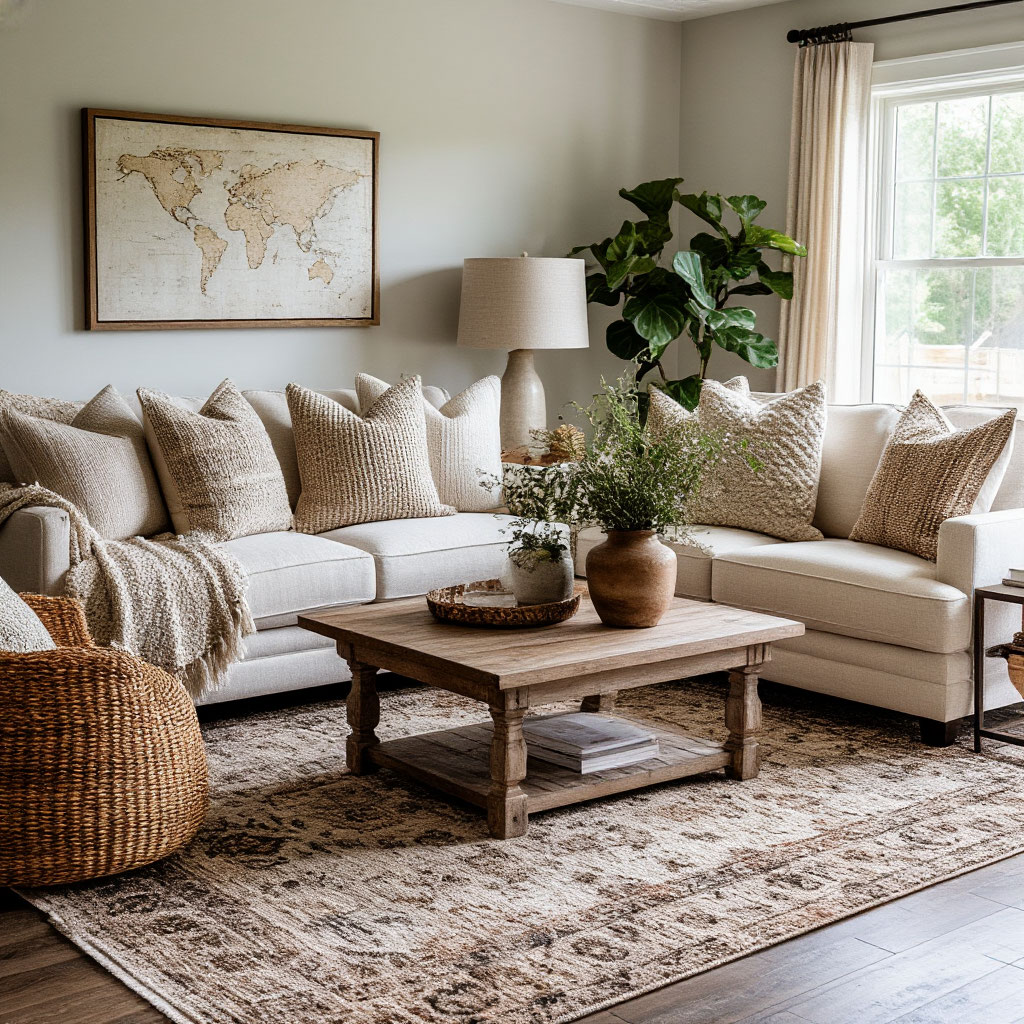
Using Home Textiles to Balance Room Proportions
Textiles are the secret weapon of great interior design. They can visually transform awkward spaces, add warmth to sterile rooms, and even trick the eye into seeing better proportions. Most people underestimate the power of:
- curtains;
- rugs;
- throw pillows.
When used strategically, they solve common room layout problems without moving a single piece of furniture.
Rugs: The Foundation You’re Probably Wrong With
Nothing makes a room feel “wrong” faster than a poorly sized rug. Too small, and the furniture will look like it’s floating. Too big, and the space will feel swallowed up. The right rug anchors your interior layout and defines zones in open-plan spaces.
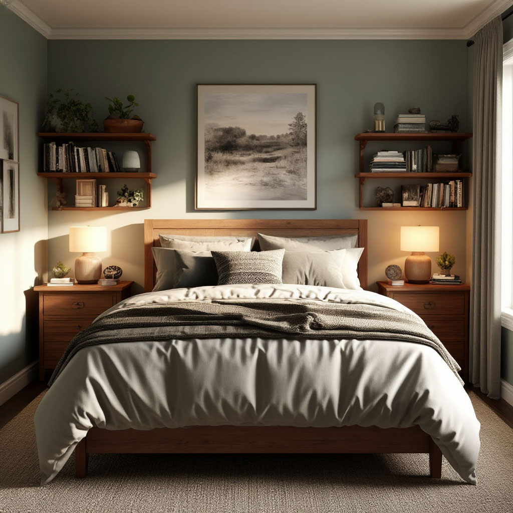
In living rooms, the front legs of sofas and chairs should rest on the rug or cover the entire piece of furniture. Dining area rugs should extend at least 24 inches beyond the table to accommodate pull-out chairs. In bedrooms, aim for an 18- to 24-inch hem around the bed. These aren’t just room-planning tips — they’re game-changers for spatial perception.
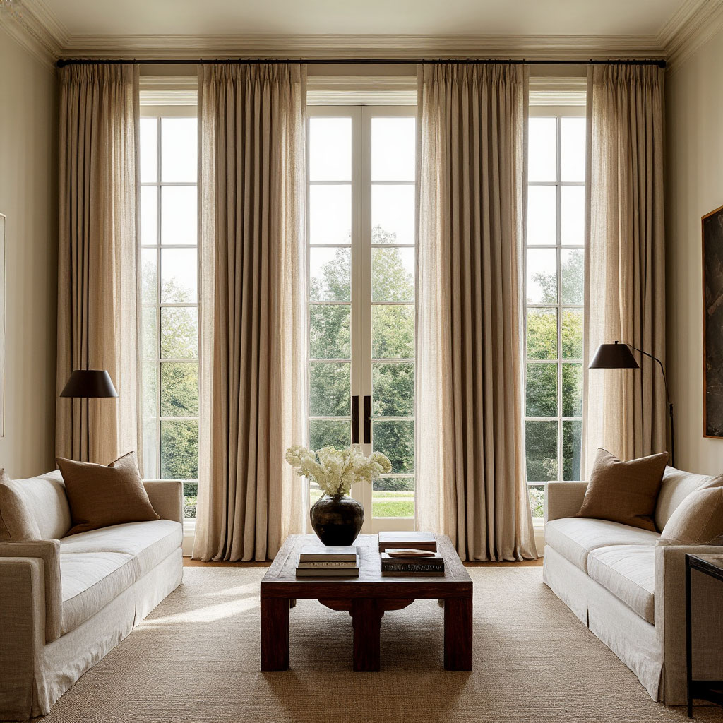
Drapes That Really Elevate Your Space
Most interior design mistakes with window treatments come down to two things: hanging them low or buying narrow panels. Install rods 4 to 6 inches above the window frame and extend them 3 to 6 inches beyond the sides.
Floor-length panels make ceilings appear higher, while heavier fabrics add weight to rooms that feel too airy. For small-space solutions, try sheer curtains that maintain privacy without blocking light — just add blackout linings where needed.
Throw Pillows and Blankets: More Than Just Decor
These throw pillows aren’t just for looks — they’re tools for balancing proportions. Overstuffed pillows on a small sofa? That’s a room-planning problem waiting to happen. Instead, vary the sizes (20×20” vs. 18×18”) and use odd groupings for visual interest.
Blankets draped casually over the corners of chairs soften the harsh lines in modern spaces. In tight spaces, fold throws neatly over ottomans instead of piling them on already cramped seating.
Strategically Place Textiles for Problem Spaces
Got a long, narrow room? Place a striped rug perpendicular to the length. Low ceilings? Hang curtains near the curtain rod. Awkward corners? A soft floor pillow and textured throw can transform a dead space into a cozy reading nook.
The best part? Unlike rearranging furniture, adjusting textiles is a no-brainer. Swap out your rug seasonally or change the sheerness of your curtains as the lighting changes — instant solutions for small spaces without the headache of remodeling.

Color and Pattern: The Proportion Cheat Code
Dark solids visually push forward (making large spaces feel cozier), while light patterned ones pull back (helping small rooms breathe). Use this to your advantage:
- A bold, large geometric rug can “squeeze” an overly spacious living room.
- Vertical striped curtains add height to squat windows.
- Monochrome bedding makes cramped bedrooms feel more spacious.
Texture as Spatial Therapy
Don’t overlook tactile elements — they act as psychological cues for your furniture. Rough jute rugs ground airy modern spaces, while silky velvet pillows add luxury to basic layouts. Mix at least three textures in any room for depth without clutter.
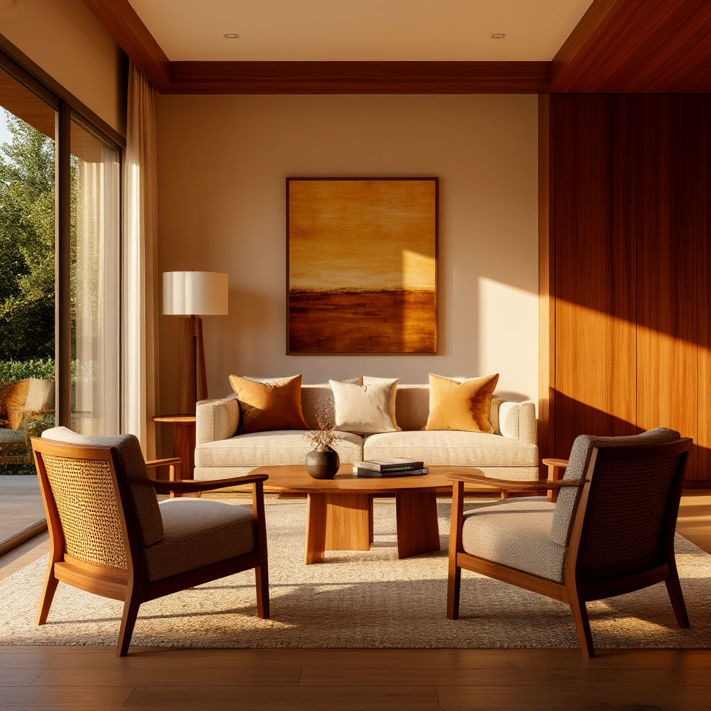
Layout Tips from American Designers
Professional designers see interior layouts differently. They can spot the subtle mistakes that most homeowners miss, and they know clever tricks to make the most of any space. After years of solving room layout problems for clients, they’ve developed effective strategies that work in real homes, not just on magazine spreads.
The 18-Inch Rule Nobody Tells You About
Ever wonder why some rooms feel just slightly off? Designers swear by maintaining precise measurements that make spaces functional yet comfortable. These industry secrets solve countless furniture flow issues instantly:
- Coffee table spacing: Keep 18 inches between seating and tables—close enough to reach your drink comfortably, but with ample legroom
- Dining areas: Allow 36 inches between table edges and walls for easy chair movement
- Bedside tables: Position nightstands within 24 inches of the bed frame for optimal reach
- Walkways: Maintain 24-36 inch pathways in high-traffic zones for natural movement
These aren’t arbitrary numbers—they’re ergonomic standards separating polished layouts from awkward ones. When measurements feel “off,” returning to these basics often reveals the room layout problem.
Diagonal Lines: A Quick Fix for Corner Rooms
Square rooms often end up with rigid, grid-like compositions that feel rigid. Designers often tilt just one key element—a chair, console table, or even a bed—to create dynamic tension. This simple trick adds movement to static spaces without requiring a complete interior overhaul.
In tight spaces, try placing a bench or storage unit diagonally in a corner. This breaks up the parallel lines while adding functionality—a perfect solution for a small space that looks intentional rather than cramped.
A Designer’s Trick for Visually Distributing Weight
Pros instinctively balance “heavy” and “light” elements. A solid wood dining table is paired with clear acrylic chairs. A chunky sectional table is balanced by the legs of the side tables. This push-pull technique prevents any one element from dominating the room’s layout.
When something feels off but you can’t quite pinpoint why, check the visual weight. Often, swapping out one bulky piece for something airier (or vice versa) will solve the problem immediately—no major purchases necessary.
Negative Space: Why Designers Leave Room to Breathe
Newbies often fill every inch; pros treasure empty spaces. Strategic negative space makes rooms look polished rather than cluttered. That empty wall between pieces of art? That bare patch of floor next to a statement chair? Intentional.
Room planning tips that instantly elevate:
- Leave at least one wall completely blank in small rooms
- Keep white space around architectural elements
- Let your best piece of furniture “float” with a large gap
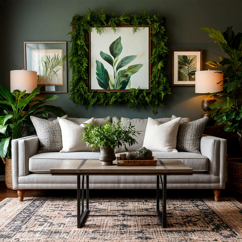
Layering Techniques for Instant Depth
Designers rarely place all their furniture against the walls. Instead, they create depth through layering—a console behind a sofa, an ottoman in front of a chair, plants at different heights. This adds dimension that flat arrangements lack.
Try placing a narrow shelf or bench behind your living room seating. Suddenly, the space has purpose and sophistication without taking up valuable square footage—a brilliant small-space solution that pros use all the time.
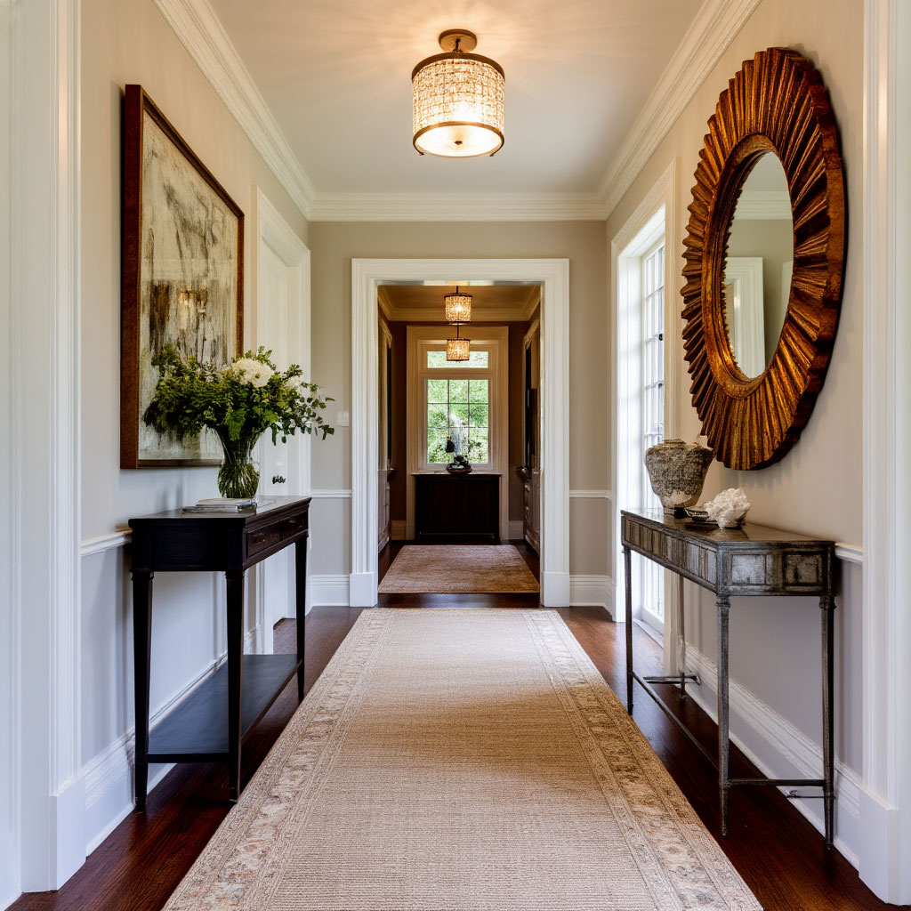
Transition Areas: Where Designers Make the Focus
The spaces between rooms matter more than most realize. Designers often place statement lighting, bold rugs, or dramatic art in transition spaces. These elements direct traffic, preventing awkward empty spaces that disrupt the flow of furniture.
A well-placed mirror between the living and dining areas visually connects the spaces. An eye-catching runner in a hallway makes it feel purposeful rather than just a walk-through. These subtle touches are the difference between a designer-level layout and an amateur attempt.
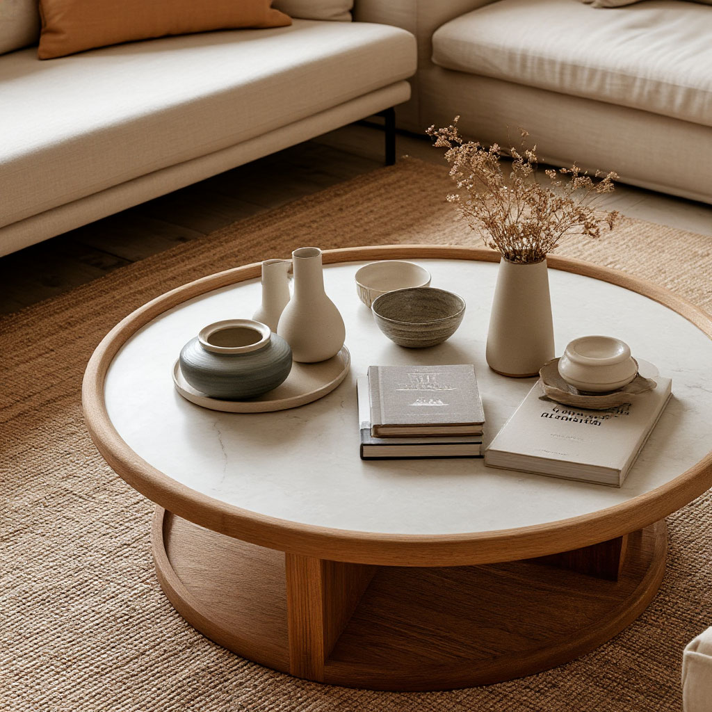
The One-Thirds Principle
Here’s a pro secret: When arranging accessories, keep items to one-third of the surface. That means if your coffee table is 3 feet wide, limit your decor to 1 foot wide. This will prevent your tabletops from looking empty or overcrowded—a common interior design mistake that’s easy to avoid.
Great interior design isn’t about following strict rules, it’s about creating rooms that work for your actual lifestyle. Whether you’re fixing interior design mistakes in your living room or implementing small-space solutions for a studio apartment, remember: good design should feel effortless.
The best spaces change over time. You might adjust the spacing of your furniture today using these furniture placement tips, and next month you might play with textiles to balance the proportions. That’s the beauty of it — your home isn’t a museum piece. Take these room-planning tips, experiment with what works for your lifestyle, and don’t worry about perfection. Remember, the best-designed rooms aren’t the ones that follow all the rules, they’re the ones that make you feel completely at home.
You can now download a checklist that summarizes the fixes — a quick reference to keep your interiors functional, balanced, and inviting.