The American Color Palette: Best Wall Colors for Each State
Contents
Choosing the right paint color for your walls can completely transform a space, but with so many options, where do you start? The American color palette is as diverse as the country itself, blending regional tastes, cultural vibes, and the latest trends. Whether you’re drawn to the cozy neutrals of the Pacific Northwest or the bold hues of the Southwest, there’s a perfect shade for every home.
Understanding the psychology of color in home decor helps set the right mood, while stateside color trends reveal what’s hot in 2025. From coastal blues to earthy greens, these US home paint ideas reflect unique regional decor styles so your walls can tell a story that’s all yours. By the end of this article, you’ll be able to download a checklist that captures the essentials and makes them easy to follow.
What is the American color palette?
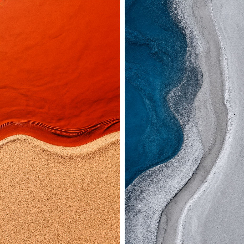
The American color palette is more than just popular paint colors — it’s a living map of the nation’s identity. From the stormy grays of Seattle to the citrus corals of Southern California, these hues tell stories about who we are and where we live. When homeowners search for the best wall colors in U.S. markets, they’re really looking for connections to their surroundings. It’s the palette’s blend of home decor color psychology with regional identity, creating spaces that feel both stylish and authentic.
Nature’s Color Wheel: Regional Influences
Mother Nature is America’s original interior designer:
- The Pacific Northwest’s signature hazy blues and mossy greens didn’t emerge from a trend forecast — they were borrowed directly from its misty forests and rocky coastlines.
- The Southwest’s clay reds and turquoise accents reflect its desert sunsets and Native American art.
- The golden wheat fields of the Midwest inspired these warm, buttery yellows that dominate farmhouse kitchens.
These regional decor styles prove that environment always trumps fleeting trends when creating timeless spaces.
Cultural Currents in Color Choices
Each state’s history leaves colorful imprints on its architecture. Colonial Virginia still favors the noble reds and navy blues of its revolutionary past, while Art Deco Miami embraces the pastel pinks and turquoises of its 1920s heyday.
Industrial cities like Pittsburgh and Detroit often lean toward steely metallics and exposed brick tones, paying homage to their manufacturing roots. The Americana color palette honors these narratives while making room for modern twists—like how Nashville’s classic rustic creams now share walls with bold, music-inspired accent colors.
The Science Behind Colors
There’s a method to why certain colors dominate regions. The psychology of color in home decor explains why Alaskans gravitate toward warm ambers (battling long winters) while Arizonans prefer cool, pale adobes.
Coastal states embrace watery blues to enhance relaxation, while mountain regions embrace evergreens to bring nature indoors. These aren’t arbitrary choices — they’re evolutionary responses to the environment. The best wall colors homeowners in the U.S. choose often unknowingly mimic their surroundings because these hues literally feel “right” in the space.
Why Your Zip Code Matters More Than Pinterest
While social media floods us with generic color trends, the smartest home paint ideas recommended by U.S. designers always start local. A perfect Cape Cod blue would feel harsh in Santa Fe, just as a desert rose would look out of place in Minneapolis.
By studying state color trends, you’re tapping into the wisdom of generations of designers. Those classic Charleston greens? They’re specially blended to complement local lighting conditions. Seattle’s favorite hazy gray? Designed to glow in that city’s unique overcast daylight.
Create with Purpose
Understanding the American color palette means recognizing that color isn’t just decoration, it’s communication. Whether you’re honoring your region’s heritage or adapting colors to your climate, these hues do more than just look pretty. They:
- connect your home to its surroundings;
- affect your mood;
- tell your story.
So before you open a can of paint, look outside. The perfect color scheme may be found growing in your yard, reflected in nearby architecture, or embedded in your state’s history.
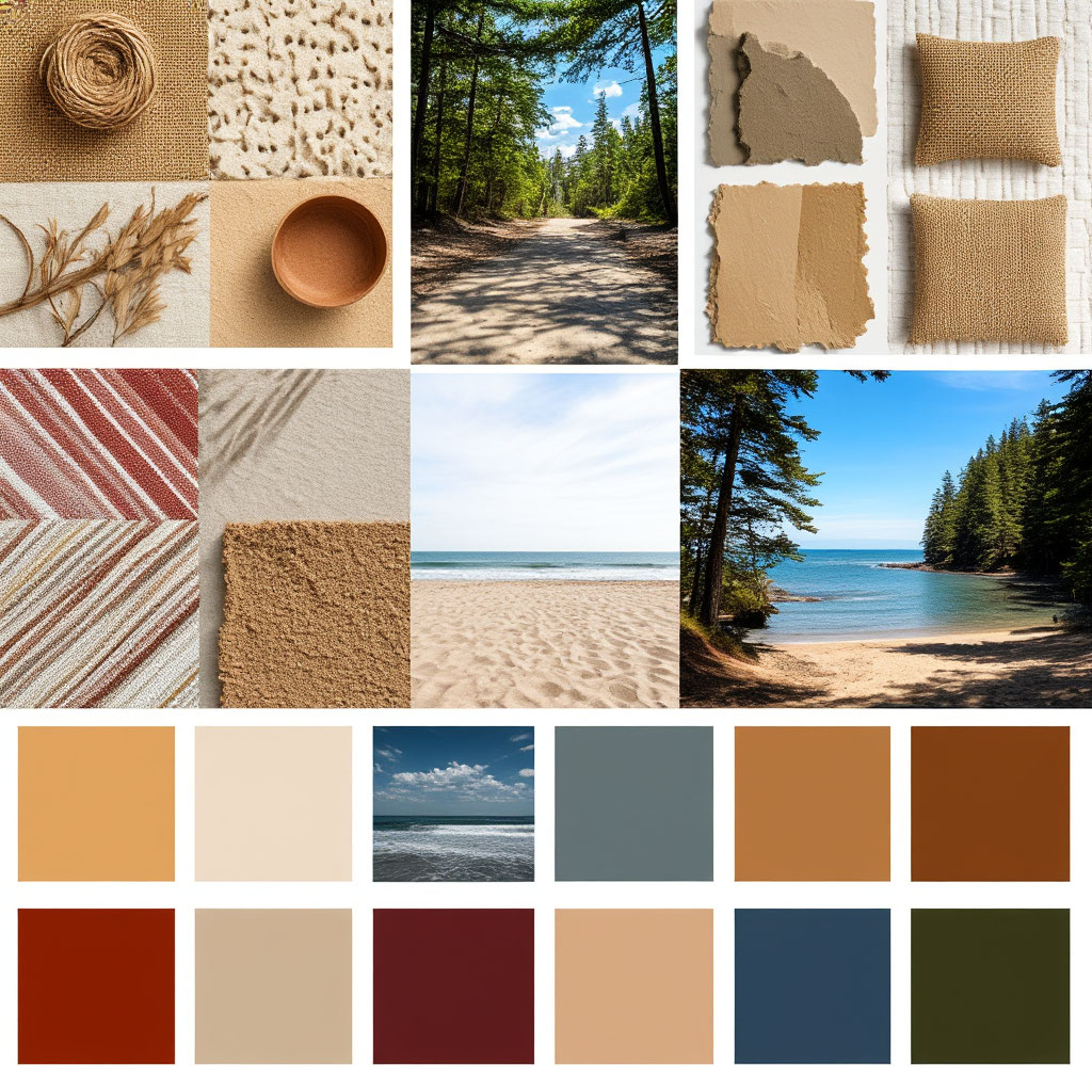
The Most Popular Colors by State in 2025
The American color palette is getting a fresh update in 2025, with each state bringing its own take on what makes a space feel like home. This year’s state color trends showcase a fun mix of nostalgia and forward-thinking design — think earthy neutrals with unexpected pops of brightness. Whether you’re remodeling or just dreaming of an update, these top wall colors homeowners are using in the U.S. can inspire your next project.
Coastal Cool vs. Desert Warmth
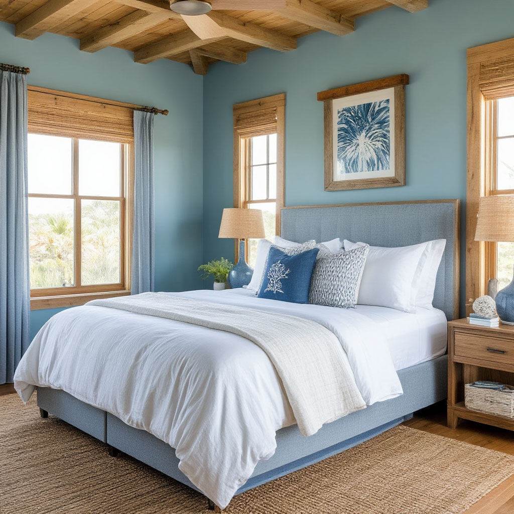
New England keeps it classic with weathered blues and creamy whites that channel its nautical roots — perfect for Cape Cod cottages or Boston brownstones. Florida is seeing a shift toward sun-bleached coral and sea foam, colors that feel like a perpetual vacation.
Meanwhile, the Southwest is leaning into its signature terracotta tones, but with a modern twist: deeper, moodier reds paired with muted sage for a desert-chic feel. These regional decor styles prove that location still dictates color more than any viral trend.
In California, the American color palette takes a sunnier approach. Los Angeles lofts lean toward golden ochre and clay pink hues, while Bay Area homes favor misty grays with hints of eucalyptus green. It’s all about the balance of warm and cool—colors that feel energetic yet grounded.
The Rise of Midwestern Moorish Hues
Forget all-white farmhouses—Midwestern interiors will embrace richer, cozier tones in 2025. Think:
- deep forest greens in Chicago apartments;
- warm caramel browns in Minnesota cabins; smoky lavenders popping up in historic Ohio homes.
- these shades do double duty, creating intimacy during harsh winters and keeping things fresh in the summer.
Texas, on the other hand, is keeping it bold. Dusty cowboy reds are updated with burnt sienna and leathery taupes, colors that reference the state’s rugged landscapes but with a sleeker finish. It’s a great example of how color psychology in home decor can honor tradition while feeling contemporary.
Unexpected Players: New Neutrals
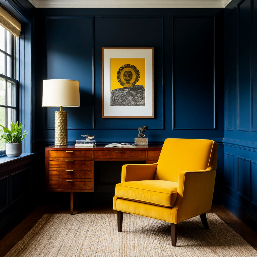
Grays and beiges aren’t going away — they’re evolving. In New York City, sophisticated charcoal tones are replacing cool grays, adding drama to small spaces. Homeowners in the Pacific Northwest are swapping stark whites for “grays” (gray + beige) with subtle green undertones, reflecting the region’s misty forests. All-black rooms are making a splash in urban lofts, proving that neutral doesn’t have to mean safe.
Southern states like Georgia and Tennessee are also reimagining neutrals. Instead of plain beige, walls are being painted creamy peaches or soft clays — colors that feel both timeless and fresh. These home paint ideas are loved by U.S. designers because they work with everything from modern furniture to antique pieces.
Standouts: Colors That Are Making a Difference
A few shades are turning heads across the country. “Front Porch Blue,” a nostalgic mid-blue with gray undertones, is popping up from Maine to Oregon, perfect for shutters or accent walls. And then there’s Spiced Honey, a golden amber that’s warming up kitchens from Colorado to the Carolinas.
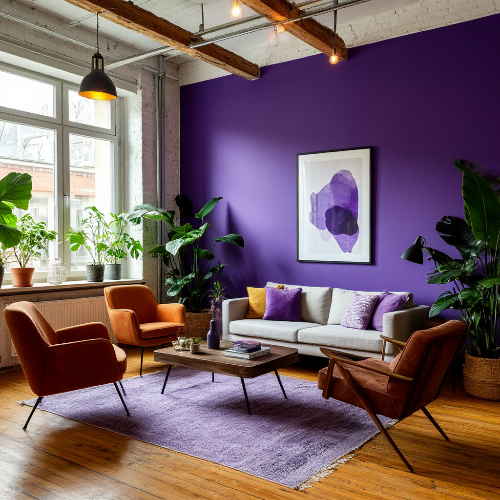
But the real surprise? Purple is having a moment — not a loud lilac, but rather subtle mauve and deep lavender popping up in bedrooms and dens. It’s a nod to color psychology in home decor, where these hues strike a balance between calm and creativity.
Why These Colors Are Working Right Now
The 2025 stateside color trends reflect a cultural shift — people want homes that feel personal, not showroom-like. This year’s American color palette is all about:
- Connection to Place (colors inspired by local landscapes).
- Comfort (warmer, more inviting tones in the wake of the pandemic).
- Flexibility (hues that pair well with natural materials like wood and stone).
Whether you’re drawn to the mountain-inspired slate blues of Montana or the tropical hues of Miami, there’s a hue that will make your space feel both fresh and familiar.
Pairing Wall Colors with Home Textiles
Choosing the right wall color is just the beginning. The magic happens when you pair it with fabrics that tie the entire room together. The American color palette provides endless inspiration, but it’s your curtains, throw pillows, and upholstery that will determine whether your space feels cohesive or chaotic. Whether you follow the latest statewide color trends or stick with classic neutrals, mastering this combination creates a look that’s polished yet personal.
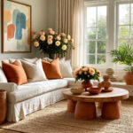
Balancing Colors Like a Pro
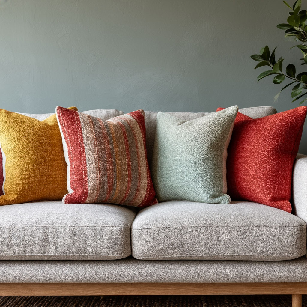
That designer-approved 60-30-10 ratio still works wonders, but today, home paint enthusiasts in the U.S. are putting their own spin on it. Imagine walls painted a calming clay tone that make up your 60% base, complemented by linen curtains that take up 30% of the visual space, with bold velvet pillows providing the final 10% of the accent.
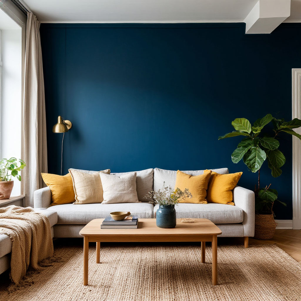
For a more dramatic approach, deep navy blue walls can be balanced with airy white curtains and natural fiber rugs. Some homeowners match their sofa to the walls for a monochromatic base, then add personality with patterned chairs and bold artwork. The American color palette really shines when you use these guidelines as inspiration rather than strict rules.
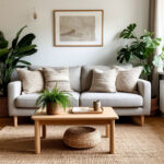
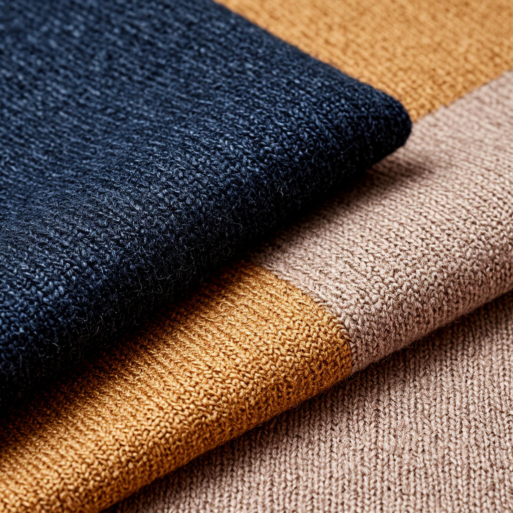
The Power of Texture
While color draws the eye, texture creates depth and interest. Take a matte olive green wall—it’s transformed when you pair it with:
- a camel wool throw;
- silky pillows with a subtle sheen;
- rustic rattan baskets.
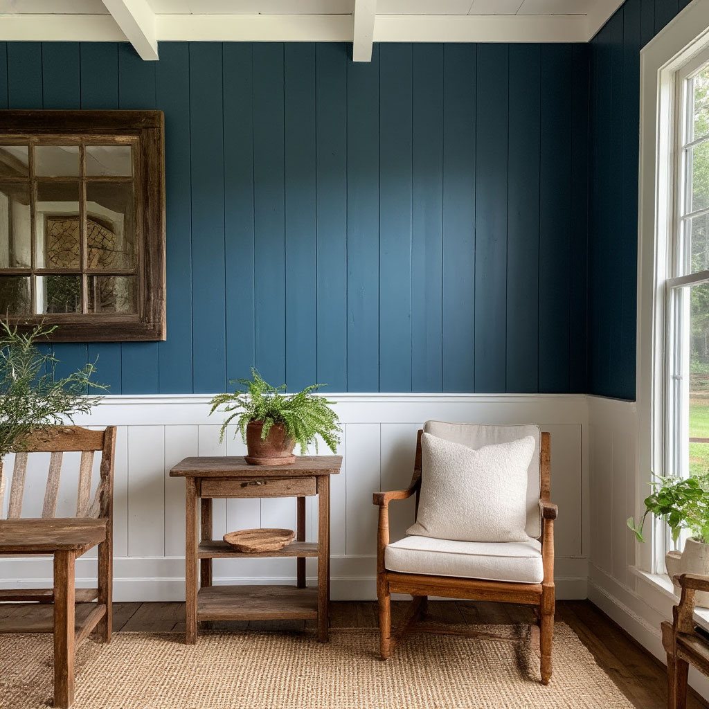
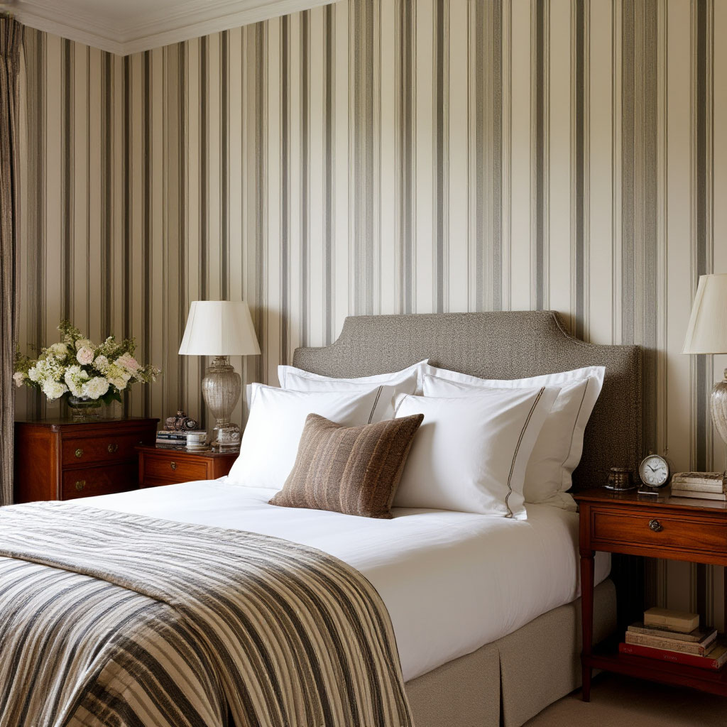
This principle applies beautifully to all regional decor styles. Southwestern terracotta walls get their richness from chunky knit blankets, while New England blue walls need crisp cotton and a smooth canvas texture to achieve the perfect nautical feel without slipping into kid-friendly territory.
Mix Patterns with Confidence
The secret to successfully mixing patterns is variation and balance. Start by mixing different scales—pair large floral curtains with small geometric pillows. Let your wall color be the unifying element that ties the different patterns together.
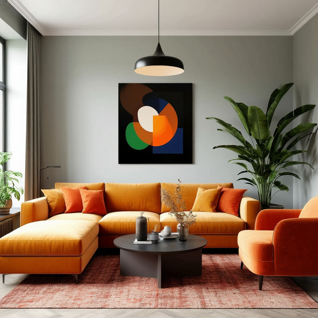
Add textural contrast by mixing flat-print fabrics with embroidered or woven patterns. Imagine a Chicago living room with steel gray walls as a neutral backdrop, large gingham wool curtains that make a statement, Persian-style accent pillows that add complexity, and a subtle herringbone throw to finish the look. The best wall colors that U.S. designers choose often act as a calming base that allows more adventurous fabrics to shine.
Regional Textile Traditions Meet Modern Walls
Different regions of the country have different fabric traditions that pair beautifully with local U.S. home paint ideas. In the South, pale peach or warm white walls create the perfect backdrop for toile de jouy cottons and faded floral chintzes, blending tradition with airy modernity. The hazy green-gray walls of the Pacific Northwest come alive when paired with heavy wool plaids and faux fur throws, adding a cozy feel to these cool, hazy tones.
In the Southwest, desert rose walls gain authenticity with woven blankets and Navajo-inspired leather accents, while rough textures provide the foundation for a romantic wall color. These combinations demonstrate how color psychology in home decor goes far beyond paint—it’s about creating complete sensory experiences.
Seasonal Adaptations That Complement Your Walls
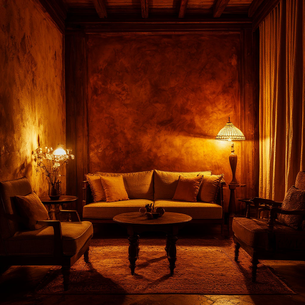
The smartest seasonal decorating works with your wall color, not against it. For warm-toned walls like terracotta, gold, or deep green, summer calls for crisp white slipcovers and lightweight linens, while winter invites velvets and knits in deeper shades.
Cool walls in gray, blue, or off-white can be refreshed in summer with seagrass rugs and lightweight cottons, then warmed up in winter with faux fur and wool tartans. This approach allows your core Americana color palette to remain consistent, while textiles provide a flexible seasonal personality.
Setting the Mood with Color and Fabric
The right combination of wall color and textiles doesn’t just look pretty — it shapes how a room feels when you walk in. That’s where the American color palette becomes your secret weapon for creating spaces that don’t just grab your attention, but actually engage your emotions. Whether you’re looking for a cozy den that embraces you or an energetic home office that sparks creativity, understanding how hues and fabrics work together is key.
Warm vs. Cool: Setting the Temperature
Warm tones like terracotta, honey yellow, and burnt orange naturally make a space feel more intimate — perfect for living rooms where you want conversation to flow easily. Pair these walls with soft fabrics like velvet or chenille to up the cozy factor. Cooler shades — like navy blue, soft lavender, or pale gray — create a completely different vibe. They work wonders in bedrooms when paired with crisp linens or airy cottons, helping the space feel serene rather than sterile.
The magic happens when you borrow from regional decor styles to enhance these effects. A sun-drenched Arizona living room might use pale adobe walls with coarse linen textiles to stay cool but inviting. Meanwhile, a Minnesota bedroom might feature deep emerald walls with wool throws for maximum hygge during those long winters.
Color Intensity: Bold or Soft
Light, muted walls act like a deep breath—they give your eyes a place to rest and make small spaces feel larger. But that doesn’t mean you have to play it safe. The best wall colors that U.S. designers are using right now often feature bold accents in strategic places. Try painting just the fireplace wall a rich espresso brown, then leaving the other walls a creamy white. The contrast creates drama without being overwhelming, especially when you add leather furniture and shaggy throw pillows that pick up the dark accent.
For those who prefer quieter spaces, tonal schemes are a great choice. Think pale sage green walls paired with sage green curtains in a slightly deeper shade and sea green ceramic accessories. The subtle change creates interest while maintaining total calm—a trick many home design enthusiasts in the US use for mindful spaces.
Pattern Personality: What Your Prints Say
Beyond solid colors, the patterns you choose send their own psychological messages:
- Large florals feel lavish and romantic, perfect for dining rooms where you want guests to linger.
- Geometric prints in contrasting colors bring energy — great for home gyms or creative studios.
- Traditional stripes create a sense of stability, perfect for home offices.
The Americana color palette shines when you layer these patterns thoughtfully. A bedroom in Coastal Carolina might have watery blue walls with crisp white bedding, then add personality with coral-print pillows and a subtle striped rug. The mix feels put together over time, rather than overly designed.
The Role of Light in the Dance of Color and Fabric
Natural and artificial light dramatically affect the interaction of colors and fabrics. North-facing rooms with cool lighting can handle warmer wall colors to balance the chill — try buttery yellows with linen curtains that diffuse the light beautifully. South-facing spaces with warm light may need cooler wall colors to prevent visual overheating — pale blues or greens will keep things fresh.
Evening lighting deserves the same attention. That perfect clay wall may look earthy during the day, but become dirty under warm bulbs. Check your in-house color trend leader any time before you decide. Pair it with fabrics with a subtle sheen — like silk-blend curtains — to reflect light beautifully after dark.
Sensory Layers: Going Beyond the Visual
Truly mood-changing rooms involve more than just sight. Rustling cotton curtains rustling in the breeze add sound. Fluffy throws invite touch. Even smell plays a role—natural fiber rugs have an earthy aroma that complements organic wall colors beautifully.
This multi-sensory approach explains why certain regional decor styles are so at home in their surroundings. New Mexico homes often pair adobe walls with rough-hewn wood furniture and hand-woven wool rugs, creating a texture-rich experience that feels truly rooted in place. Sleek New York lofts might pair matte gray walls with buttery leather sofas for a different, yet equally intentional, tactile experience.
Your Personal Color and Fabric Recipe
Finding the perfect pairing starts with asking yourself how you want each space to feel. Need a home office to boost concentration? Try medium-blue walls (seen to boost concentration) with smooth cotton upholstery and a precisely patterned rug. Creating a master bedroom that feels like a sanctuary? Soft lavender walls with cashmere throws and silk pillowcases transform a simple retreat into a spa.
The American color palette offers endless possibilities, but the final choice should be determined by your personal needs. That trendy charcoal gray may look stunning in magazines, but if it leaves you feeling gloomy, it’s the wrong choice — no matter how many state color trend lists it tops.
The American color palette is more than just paint, it’s a reflection of who we are and how we live. From the best wall colors that U.S. designers love to the fabrics that bring them to life, each choice shapes the mood and personality of a room.
Whether you’re inspired by state color trends or local regional decor styles, the key is balancing shades, textures, and lighting to create a space that feels right. Remember, great design isn’t about following rules, it’s about creating rooms that tell your story. So take these U.S. home paint ideas and make them your own. The perfect home isn’t just beautiful—it feels like you.
You can now download a checklist created to support your next steps — a practical tool to keep ideas organized and actionable.